We divide screens into 4 groups:
- Onboarding
- Core Archive
- Sharing
- Settings & Security
1️⃣ Onboarding Flow
1. Welcome Screen
-
Calm intro
-
One line value proposition:
Your private digital life. Stored locally. Owned by you.
-
CTA: “Get Started”
2. Privacy Explanation Screen
- Fully offline
- No tracking
- No cloud
- Local encrypted storage
This builds trust early.
3. Optional App Lock Setup
- Enable PIN?
- Enable Biometrics?
- Skip option available
This integrates with your LockProvider architecture.
4. Theme Selection (Optional)
- Light
- Dark
- System
Can also live inside Settings if you want fewer onboarding steps.
2️⃣ Core Archive (Main Product)
This is the heart.
🏠 5. Archive Timeline Screen (Home)
This is your main screen.
Must include:
- Chronological entries
- Entry preview (title + small image thumbnail)
- Tags preview
- Floating “+” button
- Search bar (basic title + tag search)
Minimal.
Calm.
Scandinavian.
No filters overload.
✍️ 6. Create / Edit Entry Screen
Fields:
- Title
- Body text
- Add image (optional)
- Add manual tags
- Save button
No autosave complexity.
No AI.
No templates.
Just clean writing space.
👁 7. Entry Detail Screen
- Full text
- Full image preview
- Tags
- Edit button
- Delete button
- “Share / Export” button
Simple and intentional.
3️⃣ Sharing Flow (Encrypted Bundle System)
📤 8. Share / Export Screen
- Select entries
- Enter password
- Generate encrypted bundle
- Trigger OS share sheet
No cloud.
No links.
File-based only.
📥 9. Import Screen
- Select bundle file
- Enter password
- Validate
- Show preview
- Confirm import
Imported entries marked:
isShared = true
📦 10. “Shared With Me” Screen
Separate from main timeline.
User can:
- Move to archive
- Delete
- Keep separate
Clean separation.
4️⃣ Settings & Security
⚙️ 11. Settings Screen
Sections:
Security
- Enable / Disable App Lock
- Change PIN
- Biometric toggle
Data
- Export All Data
- Delete All Data
- Storage size
Appearance
- Theme selector
About
- Version
- Privacy philosophy
- Open source link (future)
🔒 12. Lock Overlay Screen (Not a Route)
Important per architecture:
Lock is NOT a screen in navigation.
It is an overlay wrapped by:
<LockProvider>
   <NavigationContainer>
It appears:
- On app launch
- When backgrounded
This follows blueprint rule
🧭 Final Screen List (MVP Locked)
- Welcome
- Privacy Info
- Lock Setup
- Theme Setup (optional)
- Archive Timeline
- Create/Edit Entry
- Entry Detail
- Share / Export
- Import
- Shared With Me
- Settings
- Lock Overlay (infrastructure)
🚫 What We Are NOT Adding (First 90 Days)
- No analytics dashboard
- No advanced filters
- No archive folders
- No collaboration
- No AI assistant
- No web version
- No multi-device sync
- No feature explosion
This respects MVP Boundaries
🎯 Minimal Navigation Map
Onboarding Stack
    → Main App (Tab or Stack)

Main Stack:
    Archive (Home)
        → Entry Detail
        → Create/Edit
        → Share
    Shared With Me
    Settings
Stitch (Google AI UI generator)
If you use Stitch (Google AI UI generator) properly, you’ll get production-grade layout inspiration — not random dribbble fluff.
Because Offline Life Archive has a very strong philosophy (privacy-first, calm, Scandinavian minimal), your prompt must be:
- Product-aligned
- Emotion-aligned
- Constraint-driven
- Clear about what NOT to include
Below are ready-to-copy prompts per screen.
🎯 Master Style Prompt (Use This At Top of Every Prompt)
Paste this first in Stitch before each screen request:
Design a minimal, Scandinavian-style mobile app UI.
Calm, privacy-focused, distraction-free.
Soft neutral colors (off-white, light gray, muted blue).
Clean typography.
No gradients.
No bright colors.
No gamification.
No social elements.
Designed for a privacy-first offline memory archive app.
This anchors the design philosophy.
🏠 1️⃣ Archive Timeline Screen Prompt
Create a mobile app home screen for a privacy-first offline memory archive.

Screen name: Archive

Include:
- Simple header with title "Archive"
- Minimal search bar (search by title or tag)
- Chronological vertical timeline of entries
- Each entry card shows:
    - Title
    - 1–2 line preview text
    - Small image thumbnail (optional)
    - Subtle tags
    - Date (small, subtle)
- Floating action button (+) to create new entry

Design must feel calm, intentional, and not crowded.
No analytics.
No charts.
No filters.
No bottom nav with many tabs.
✍️ 2️⃣ Create / Edit Entry Screen Prompt
Design a minimal entry creation screen for a private offline memory app.

Screen name: New Entry

Include:
- Back button
- Title input field (large, clean)
- Multiline text area for writing
- Section to add multiple images (max 5)
- Simple tag input field
- Save button (subtle, not flashy)

Layout should prioritize writing space.
No formatting toolbar.
No emoji reactions.
No AI suggestions.
No productivity elements.
Clean and focused writing experience.
👁 3️⃣ Entry Detail Screen Prompt
Design a memory detail screen in a privacy-focused mobile app.

Include:
- Title
- Full text body
- Scrollable image gallery (minimal dots indicator)
- Tags below content
- Subtle edit button
- Subtle delete option

No social sharing icons.
No likes.
No comments.
No cloud sync indicators.

Design must feel intimate and personal.
📤 4️⃣ Share / Export Screen Prompt
Design a secure export screen for a privacy-first app.

Include:
- Select entries list (minimal checkbox style)
- Password input field for encryption
- Primary button: "Generate Encrypted File"
- Subtle explanation text about file-based encrypted sharing

No cloud upload UI.
No social media icons.
No public link options.
Must look secure and calm.
📥 5️⃣ Import Screen Prompt
Design an import screen for encrypted memory files.

Include:
- Select file button
- Password input
- Preview section after decryption
- Confirm import button

Minimal UI.
No animations.
No complexity.
Focus on clarity and trust.
⚙️ 6️⃣ Settings Screen Prompt
Design a minimal settings screen for a privacy-first archive app.

Sections:
Security:
- Enable app lock toggle
- Change PIN
- Biometric toggle

Appearance:
- Theme selection (Light / Dark / System)

Data:
- Export all data
- Delete all data

About:
- App version
- Privacy philosophy

No clutter.
No promotional banners.
No gamification.
🔒 7️⃣ Lock Screen Prompt
Design a clean PIN lock overlay screen for a privacy-first mobile app.

Include:
- Minimal logo or app name
- PIN entry dots
- Numeric keypad
- Biometric icon option
- Calm background

No bright colors.
No flashy animations.
Must feel secure and respectful.
💡 Advanced Tip (Very Important)
At the end of each prompt, add:
Use spacing generously.
Avoid crowded UI.
Design for emotional safety and privacy.
That forces better output.
🚀 If You Want Next-Level Results
After generating each screen, ask Stitch:
Now redesign this with even more minimalism and fewer visual elements.
Remove anything unnecessary.
Iteration improves quality drastically.
Home Screen design using Stitch
prompt for stitch
Create a mobile app home screen for a privacy-first offline memory archive.

Screen name: Archive

Include:
- Simple header with title "Archive"
- Minimal search bar (search by title or tag)
- Chronological vertical timeline of entries
- Each entry card shows:
    - Title
    - 1–2 line preview text
    - Small image thumbnail (optional)
    - Subtle tags
    - Date (small, subtle)
- Floating action button (+) to create new entry

Design must feel calm, intentional, and not crowded.
No analytics.
No charts.
No filters.
No bottom nav with many tabs.

Design a minimal entry creation screen for a private offline memory app.

Screen name: New Entry

Include:
- Back button
- Title input field (large, clean)
- Multiline text area for writing
- Section to add multiple images (max 5)
- Simple tag input field
- Save button (subtle, not flashy)

Layout should prioritize writing space.
No formatting toolbar.
No emoji reactions.
No AI suggestions.
No productivity elements.
Clean and focused writing experience.

Use spacing generously.
Avoid crowded UI.
Design for emotional safety and privacy.
Result:
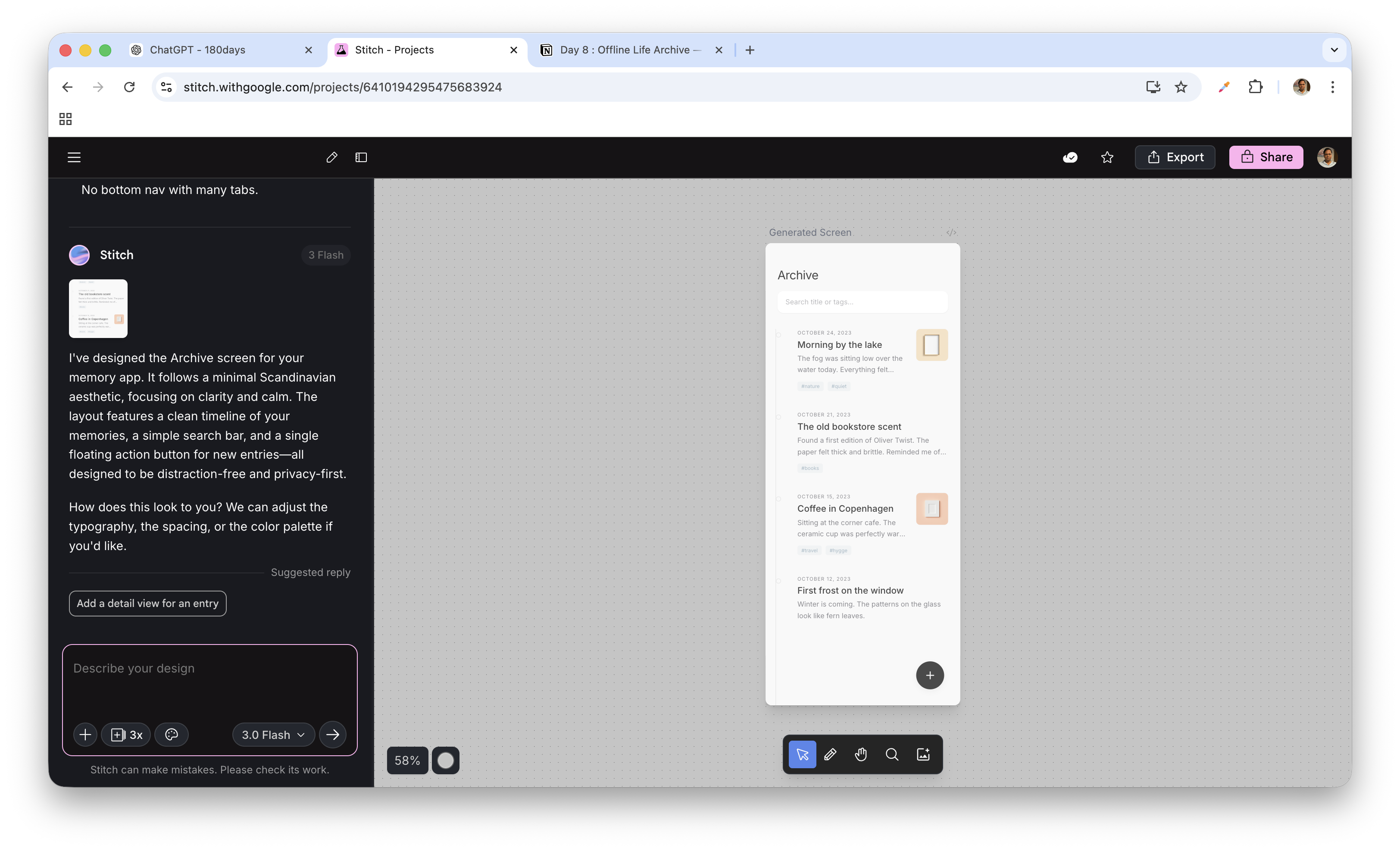
This is actually very good for a first generation.
Stitch understood your philosophy correctly. 👏
Now let’s review it like a product owner, not like a designer.
✅ What Is Working Well
1️⃣ Emotional Tone — ✔ Excellent
- Calm
- Neutral palette
- Soft spacing
- No visual noise
- No gamification
This matches:
“Your private digital life. Stored locally. Owned by you.”
Good alignment with product definition.
2️⃣ Timeline Structure — ✔ Correct
- Chronological grouping by date
- Clean entry cards
- Subtle tags
- Search at top
- Floating + button
This respects MVP boundaries:
- No filters overload
- No analytics
- No cloud indicators
Very disciplined.
🔍 What We Should Improve (Product Owner Mode Activated)
Now we refine it to feel premium and intentional, not “AI-generated minimal template”.
🔹 1. Header Feels Slightly Generic
Right now it says:
Archive
Consider upgrading the emotional tone slightly.
Instead of just:
Archive
Try:
Option A:
Archive
Your private timeline
Option B:
Archive
subtle lock icon (very minimal)
Prompt to refine in Stitch:
Make the header feel more premium and intentional.
Add subtle personality without adding visual clutter.
Keep it minimal.
🔹 2. Entry Cards Need Slight Hierarchy Boost
Right now:
- Title
- Preview
- Date
- Tag
But the hierarchy is a bit flat.
We want:
- Title: Strongest
- Date: Small & subtle
- Preview: Soft gray
- Tags: Very light pill style
Prompt:
Improve typography hierarchy.
Make title stronger.
Make date smaller and lighter.
Make preview text softer.
Keep minimal aesthetic.
🔹 3. Floating Button Is Slightly Heavy
The + button feels slightly dark and attention-grabbing.
In a calm app, we want it softer.
Ask Stitch:
Make the floating action button more subtle.
Use muted tone instead of dark gray.
It should not dominate the screen.
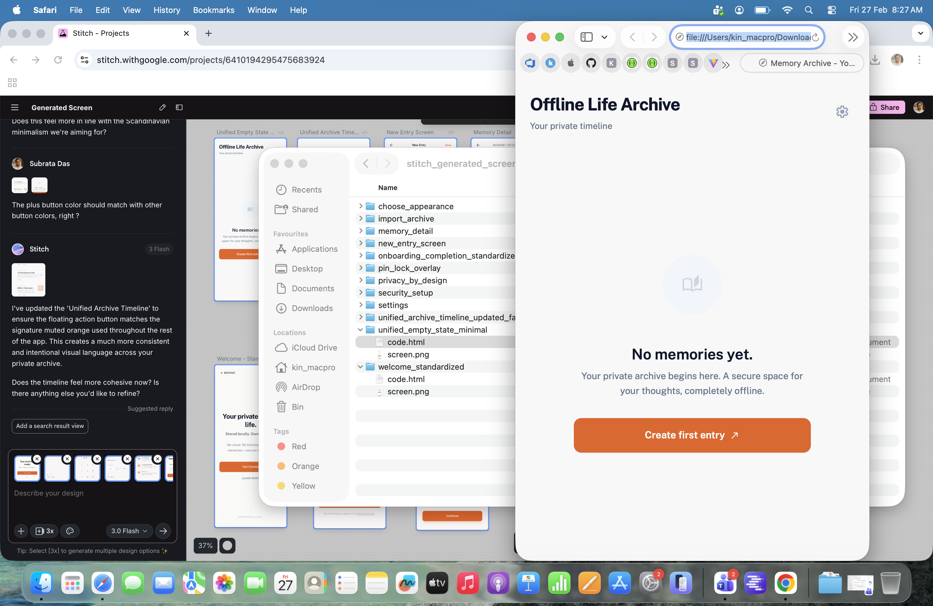
🔹 4. Add Empty State Design (Very Important)
Right now we see populated state.
But MVP must define:
- What if no entries exist?
Ask Stitch:
Design the empty state for the Archive screen.
Show a calm message like:
"No memories yet."
Add subtle explanation:
"Your private archive begins here."
Include a minimal create button.
Keep calm tone.
Empty state is emotional moment.
🚀 Next Step
Tell Stitch:
Refine this screen to feel more premium, calmer, and less template-like.
Increase spacing.
Improve typography hierarchy.
Soften floating action button.
Add empty state variation.
The updated version after the prompt.
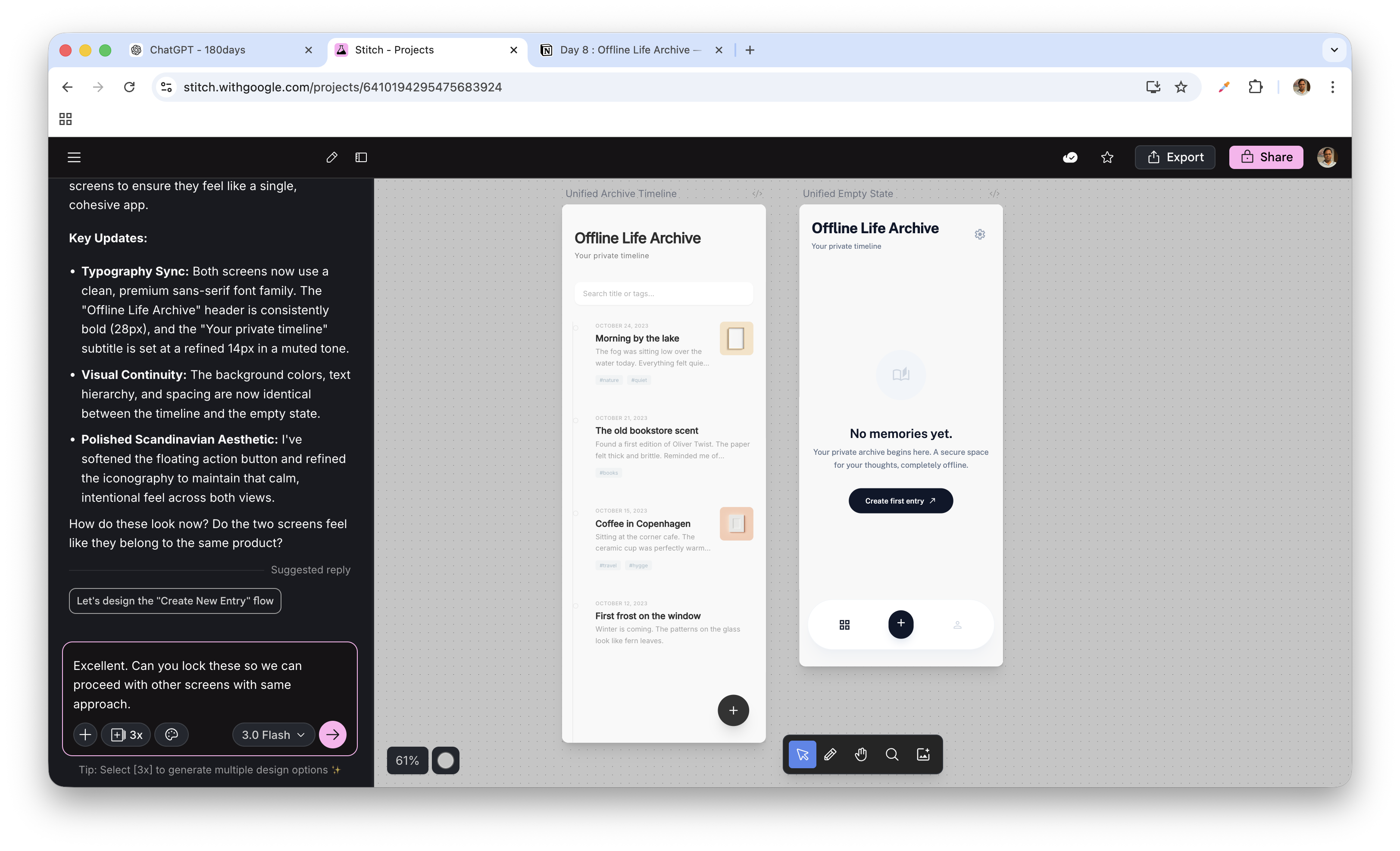
We are now polishing, not designing.
That’s the difference between a developer and a product owner.
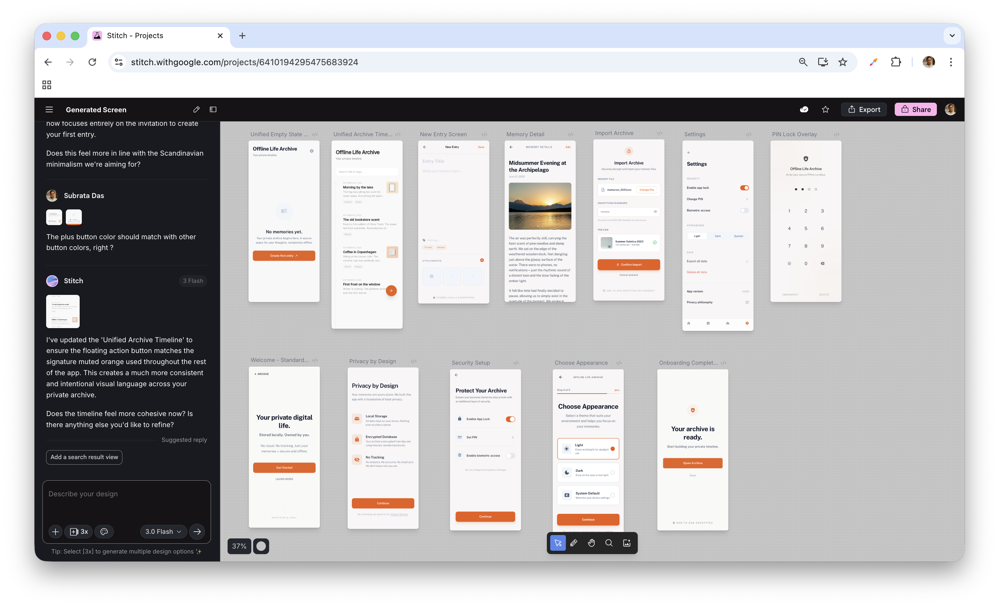
Create your screens ready, we will meet on Monday again on Day 11.
My screens look like below after refining.
The best part is when exported as zip, it exported images as well as html files of screens.
when I exported the designs as a ZIP file, it generated:
- Screen images
- Structured HTML files for each screen
Not just pretty visuals — but usable structure.